June 30, 2023
•
3 min read
New design capabilities in the Page Builder can transform the user experience on your sites.
The release of our new Page Builder means faster, easier, what-you-see-is-what-you-get page-building. (Request access to the Page Builder here if you don’t have it already.) But you get something else, too: added design flexibility. And with that, new ways to apply your brand, customize the user experience and highlight what matters most to your user base.
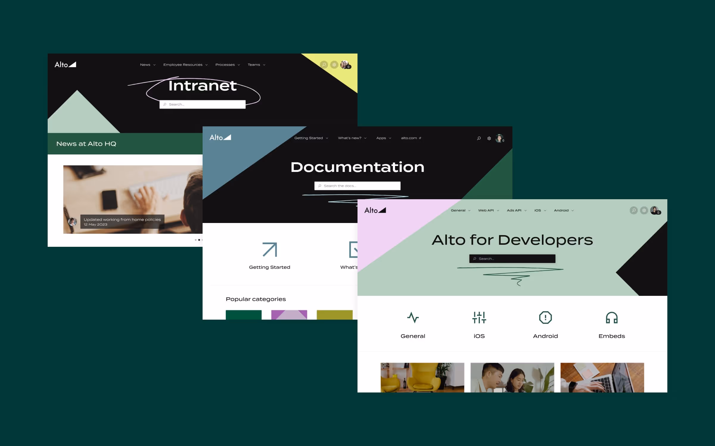
Whether you’re building an intranet, a documentation site, a help site, or something else entirely, here are four ways you can use the new Page Builder to breathe new life in your designs.
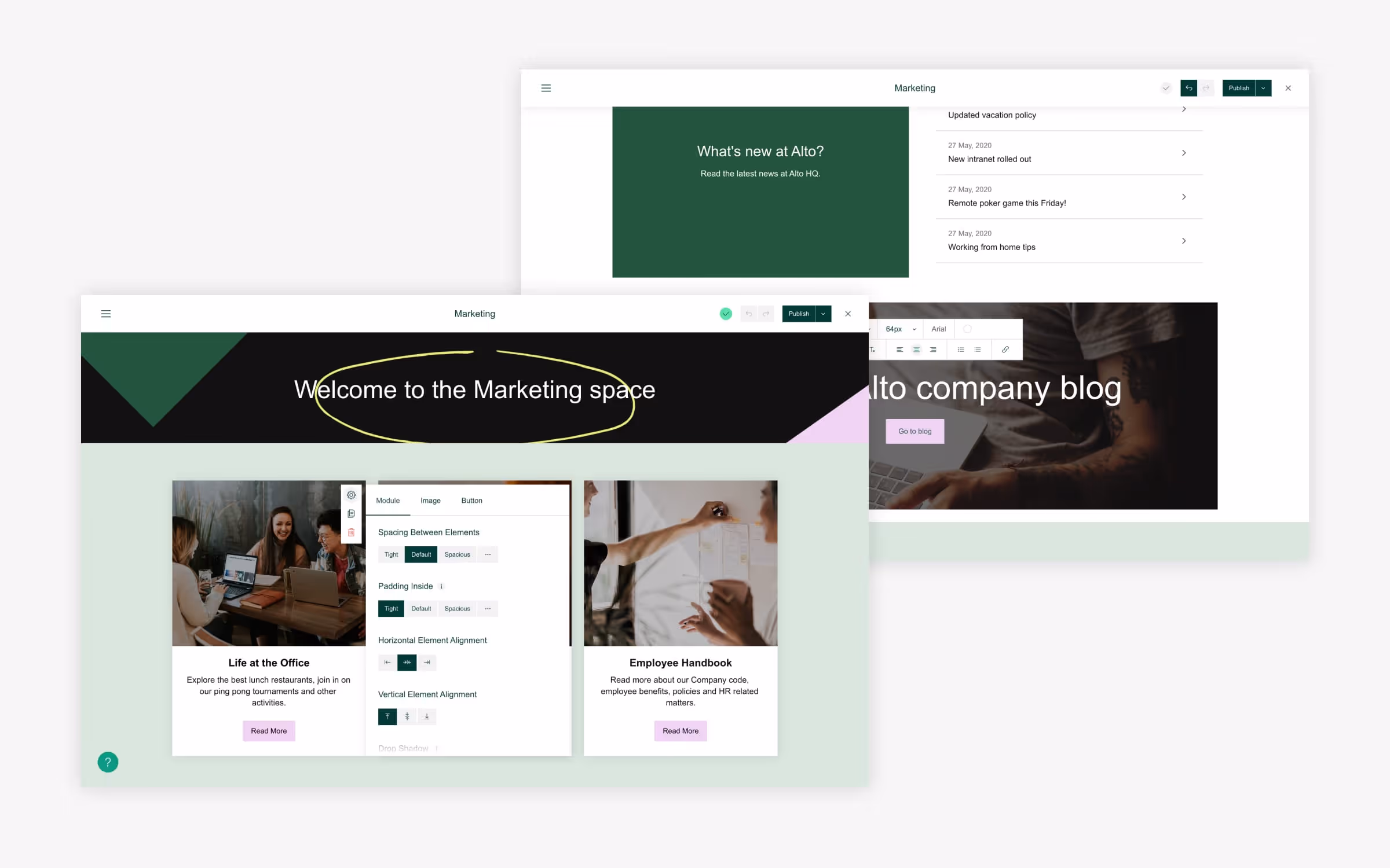
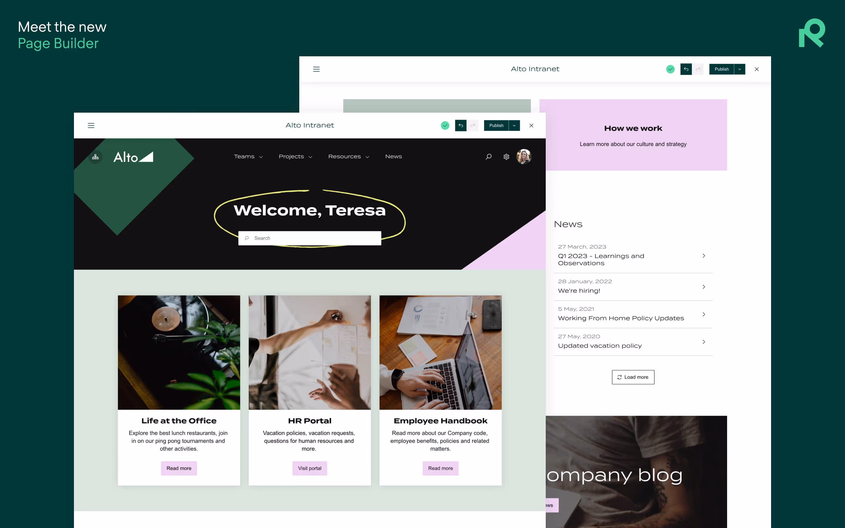
The Page Builder takes a containerized approach to page building. First you add sections, then rows and columns within sections, and finally modules to fill out the rows.
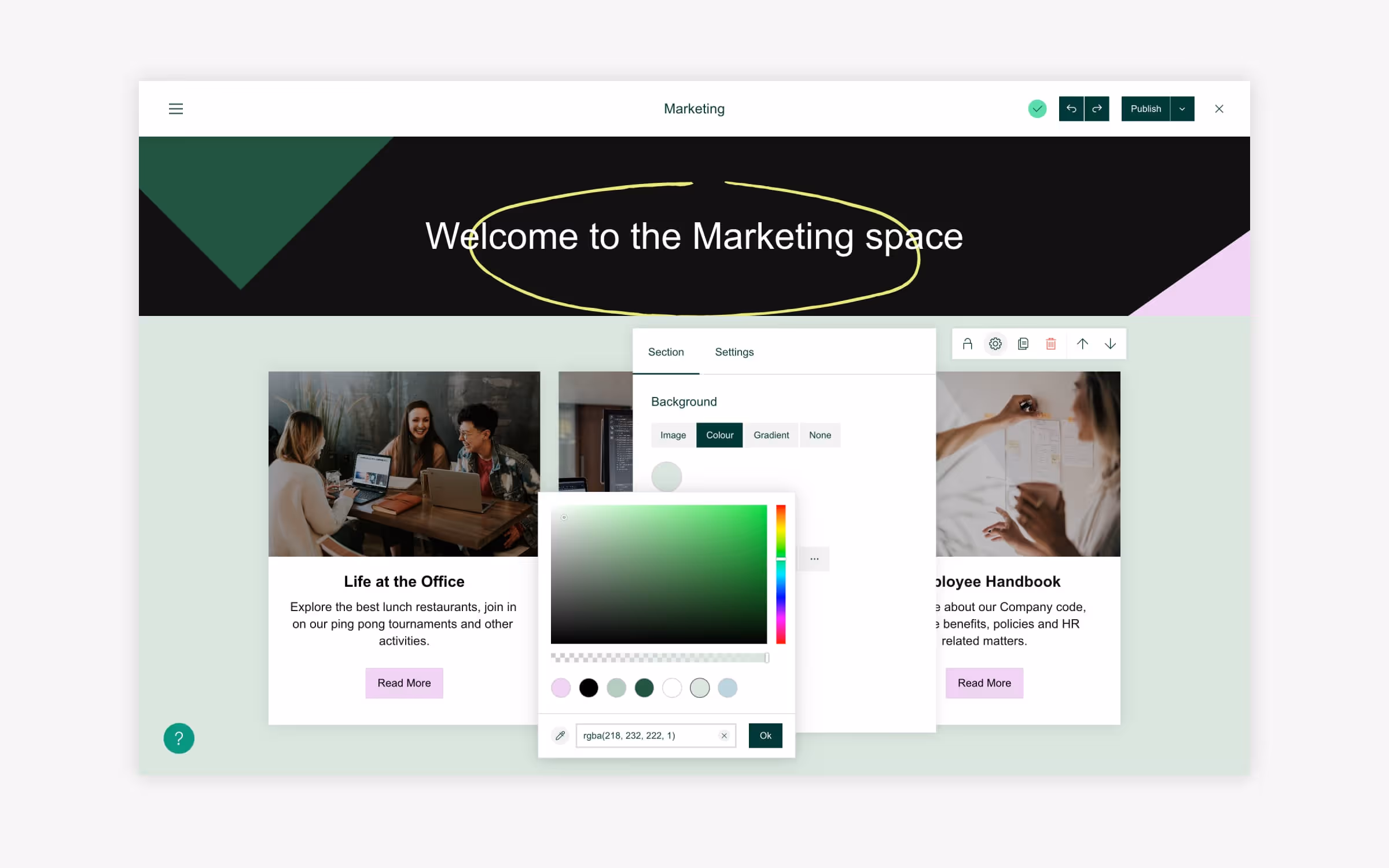
The Page Builder allows you to apply background colors to sections, meaning you can to do away with white space on large swaths of the page, or across entire pages if you wish. You can apply the same background to every section, or different backgrounds to break up the page. You can also apply background images in lieu of colors.
In the examples below, Alto applied a light, muted green as a complement to the bolder greens and pinks in the hero section.
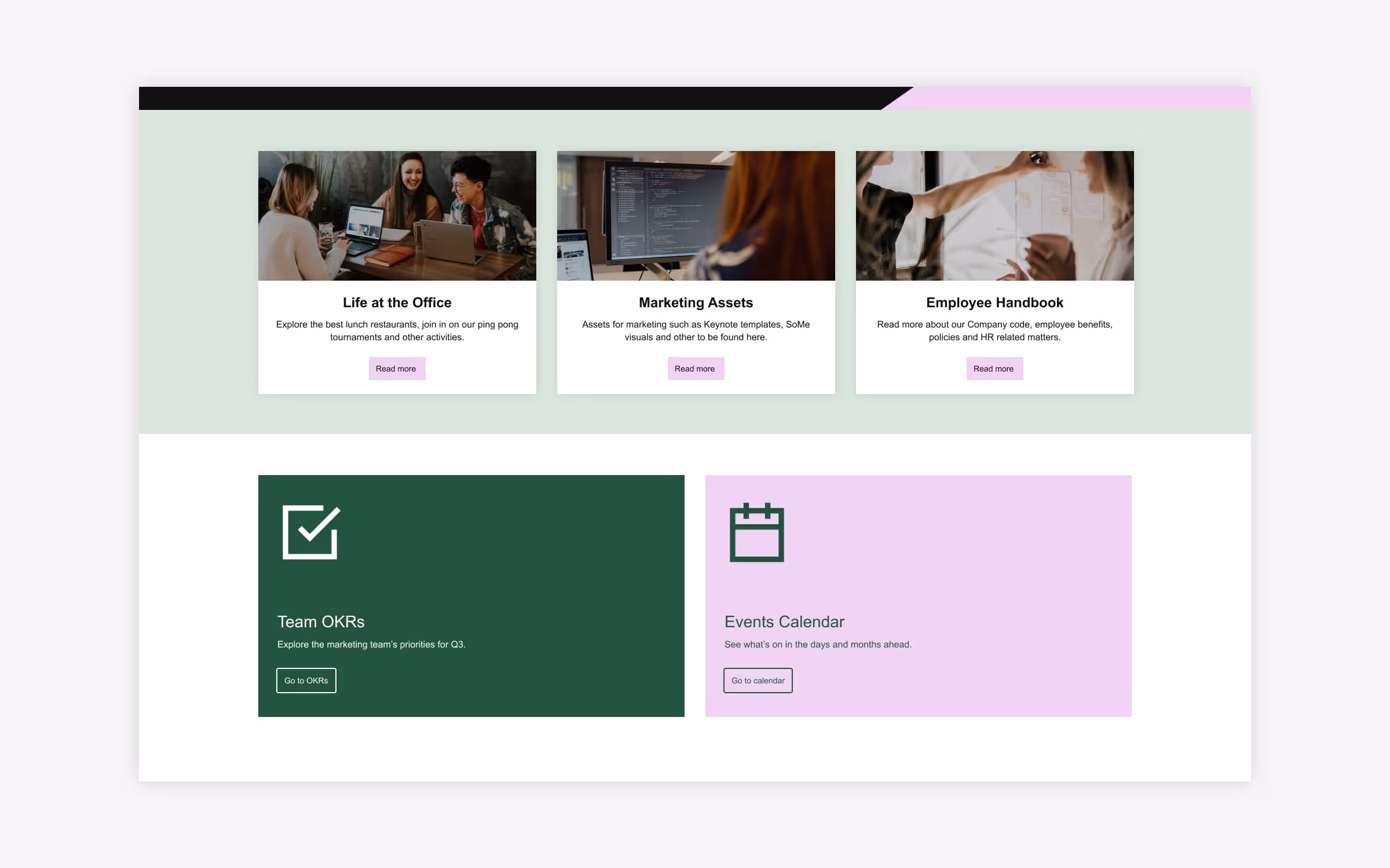
The Page Builder makes it easier than ever to create varied, engaging CTAs. New capabilities in modules can help you guide users toward important documentation, request types, links, and other elements.
In the example below, the Image Card module is styled in two distinct ways. Modules in the top row contain photos plus text and pink CTA buttons laid over a white background. In the bottom row, the same module is styled differently: solid-color backgrounds, left-justified icons, minimal text, and a background-colored CTA button styled with a border.
The result: Visual differentiation helps users digest their options, all while treating them to a more-varied, aesthetically pleasing design.
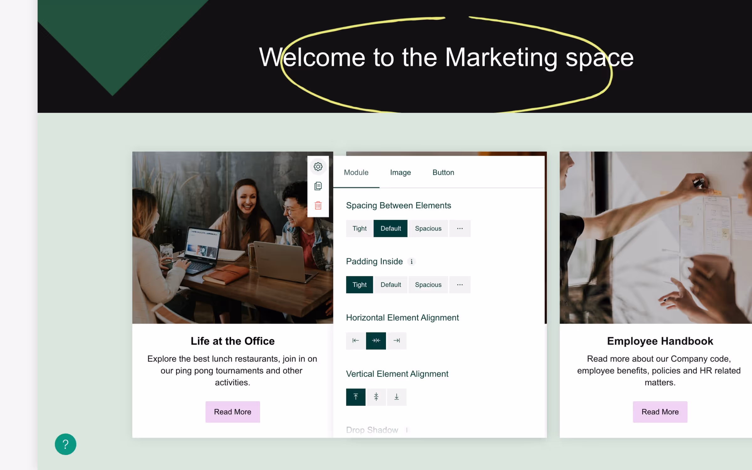
Any designer will tell you that spacing is a chief consideration when it comes to page layouts, and brands typically have guidelines about how much padding to use between objects, around logos, etc.
Modules in the page builder allow you to:
Explore a full list of modules available in the Page Builder and how you can customize them here.
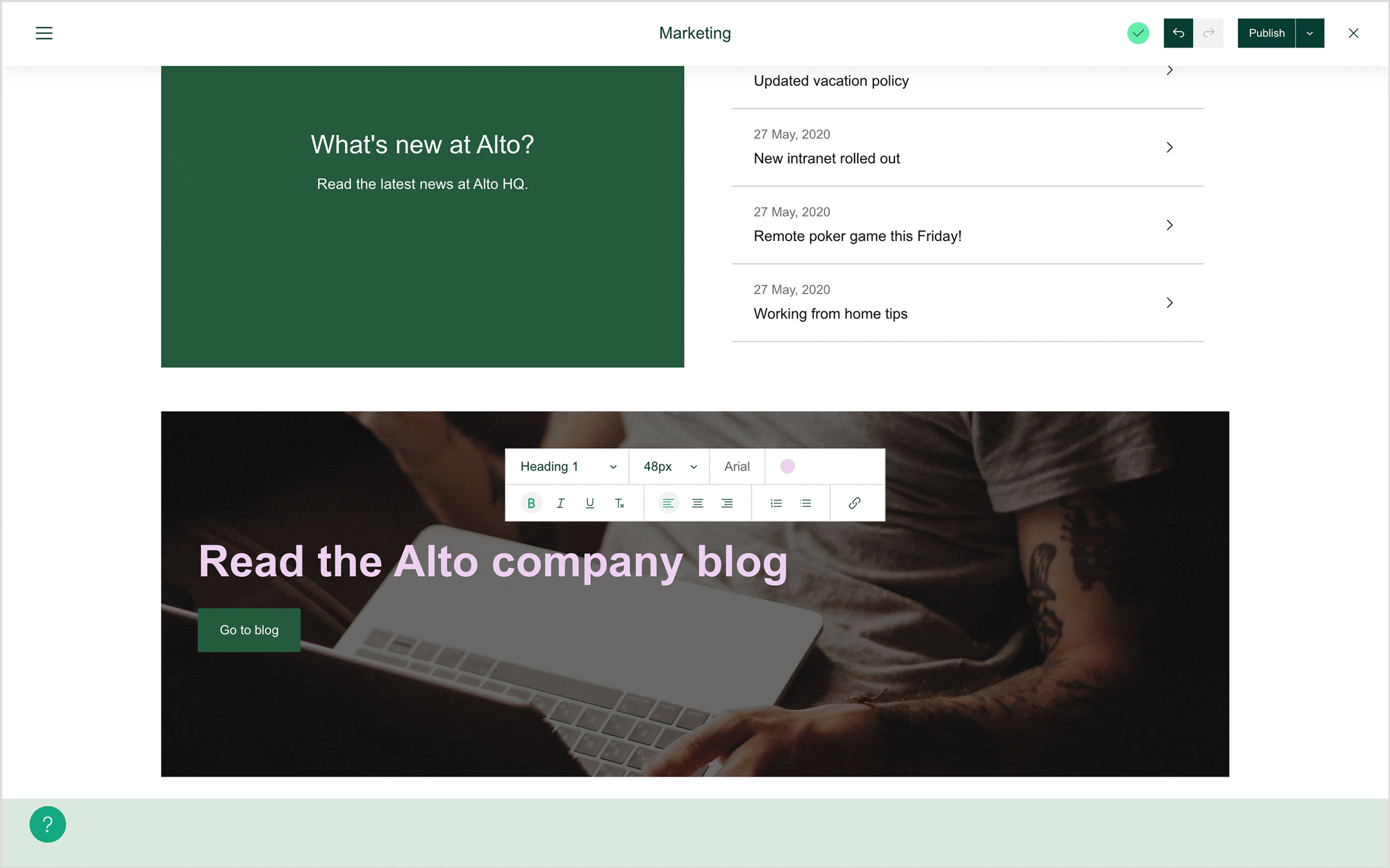
Applying text on-page is easier than ever in the Page Builder. Simply click on text where it appears, and a text editor allows you to set fonts, colors and sizing, as well as adjust positioning, apply bullets & numbering, add an underline, etc.
The added flexibility means that text can now be treated as a design element—to make a message pop, ensure that key information goes un-missed, or to better express your brand identity.
The Page Builder is available for all new cloud customers, and we’re rolling it out in phases to everyone else. If you don’t have access and you want to take it for a spin, request access here.
Try Refined Sites free for 30 days on the Atlassian Marketplace.

